Spaced Out - CS148 Ray tracing Project
This write-up was initially the README for a private repo only the TAs could see. I decided to repost the write-up here, separate from the code. The project is from 2014.
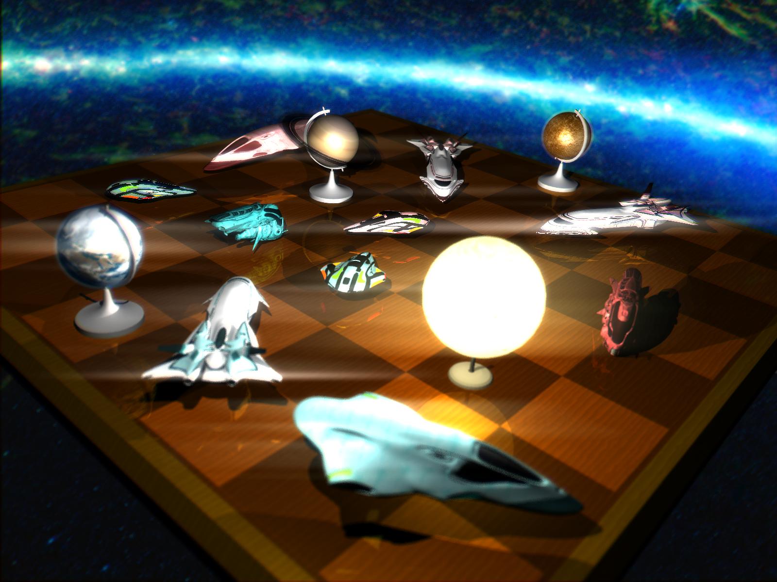
CS148 Final Ray Traced Image, created by Harrison Ho and Varun Ramesh.
Our idea was to represent a tabletop game that the players imagine is actually taking place in space.
- Space background by NASA.
- Spaceships created by TF3DM user herminio.
- Textures were taken from CGTextures.
- Other models were made in Blender.
Technical Contributions
We modified the Render function to spawn 8 threads that split work on the width of the image. We implemented emissive media (atmospheres), as well as the ability to use an image’s alpha channel to make parts of a face transparent (clouds / saturn ring). We also implemented post-processing. The image is converted to luminosity values, and set to the powers of 2 and 8. The power 2 image is used for an outward radiating glow, while the power 8 image is used for a horizontal flare. We also perform chromatic aberration, with more aberration on the edges than center.
Progress
First Submission
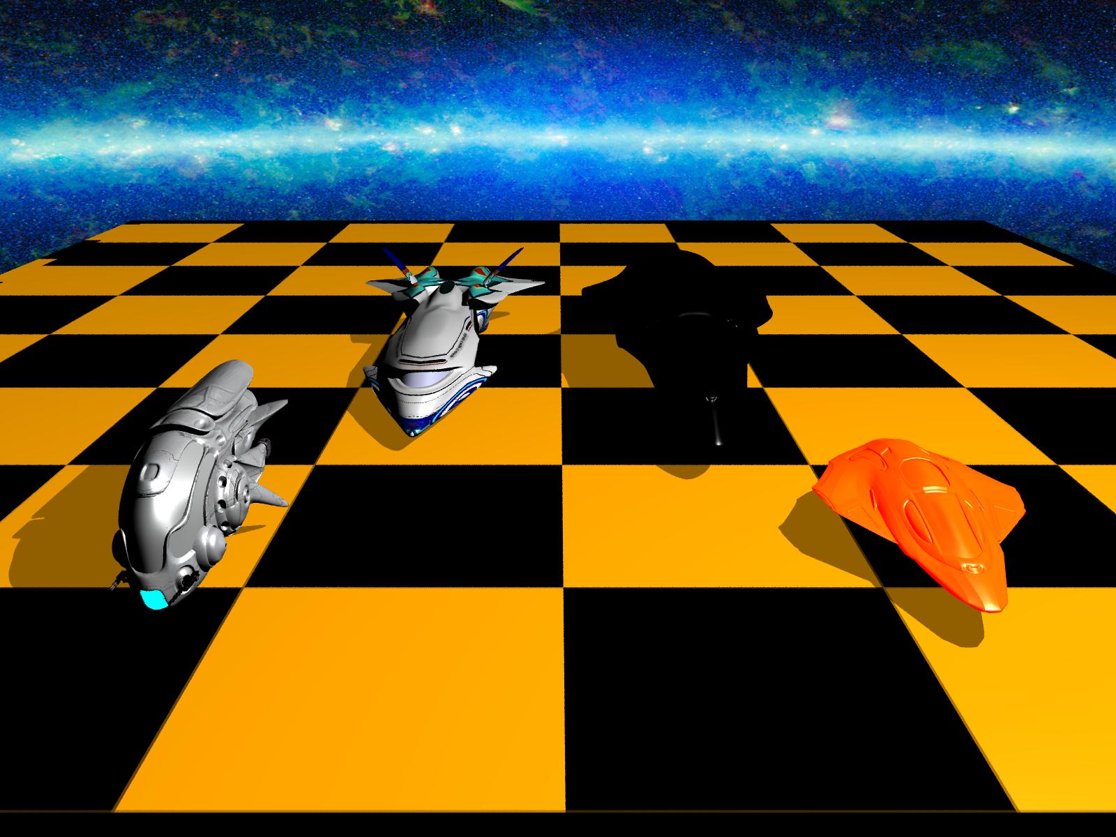
In our first in-class demo, we had worked on obtaining meshes for our scene and doing preliminary rearranging of objects. Unfortunately, because the initial ray tracer code does not allow for multiple textures for each mesh, some of our meshes on the right side were colored incorrectly. The image without post-processing is shown here:

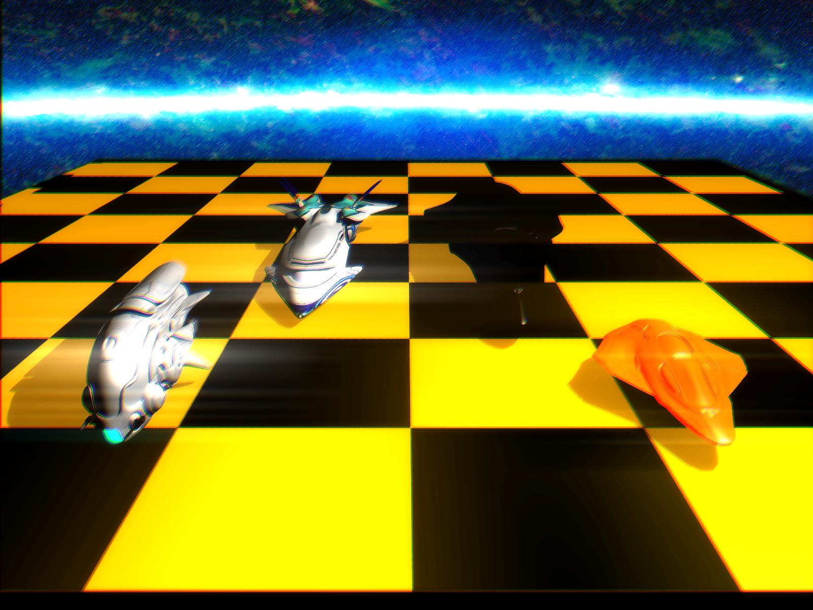
In addition, we had implemented some post-processing effects, including lens flares and chromatic aberration. The image with post-processing is shown here:

Development
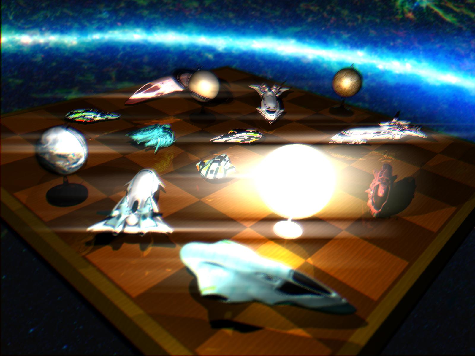
As we continued adding to the image, we added more ship meshes and added planet meshes as well. We implemented emissive media for the planet atmospheres and made some elements transparent, such as the rings of Saturn. In addition, we made stand meshes in blender to be used with the planets to add a board game feel to the scene. An in development picture is shown here:

During development, we still had numerous issues. Lens flares were too dramatic, causing the entire scene to become too bright. In addition, the scene was too blurred to see any meshes clearly.
Final Submission
In our final demo, we had finished the blur and the lens flare issues from previous versions of the image. We colored the ships differently to indicate which ships are part of which team. We had also modified the color of the stands to make them more visible. The finished result is here:

Additional Work
After the final demo, we wanted to experiment with how the scene would look for camera angles. Using the barley machines at Stanford, we submitted jobs to render frames of the scene from different angles, and combined the frames together in a 24 fps video. The resulting video shows how different elements such as the reflections of the objects off of the board and the lens flares move with the rotating camera. A video showing our scene from different camera angles can be found here.